“Cracker Barrel’s new logo after 48 years blends tradition with modern style. Discover why this bold change matters for loyal fans”.
For nearly five decades, Cracker Barrel has been more than just a restaurant—it’s been a symbol of country hospitality values and warm Southern traditions. Known for its rocking chairs, old-fashioned décor, and comforting meals like Uncle Herschel’s Favorite, the brand has carried a strong identity rooted in nostalgia.
But in Aug. 19, 2025, the company made headlines with a bold step: a new simplified logo. This Cracker Barrel logo change marks the first major redesign since the 1977 logo update. The shift raises big questions about tradition, branding, and the future of one of America’s most recognizable dining experiences
The History of the Cracker Barrel Logo
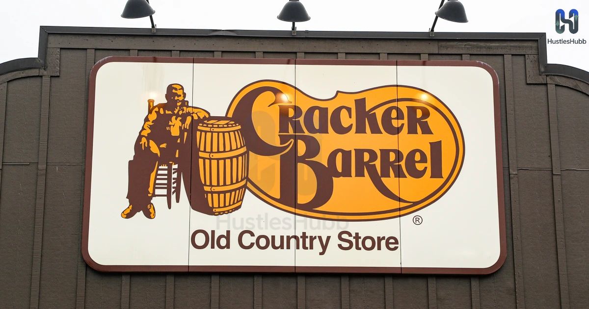
The first Cracker Barrel logo appeared in 1969, simple and text-based, at the launch of the restaurant. By the 1977 logo update, the brand added its now-iconic image: a man in suspenders sitting by a wooden barrel, a design that instantly symbolized Southern living and warm hospitality. This logo was more than just a graphic; it became a cultural landmark tied to road trips, rocking chairs, and biscuits served by the fireplace.
For nearly five decades, this artwork represented the heart of the brand’s country hospitality values. Families often spoke of the logo as part of their traditions, and for many nostalgic Cracker Barrel customers, the image carried a sense of comfort and belonging. That is why the new shift to a modern farmhouse aesthetic has sparked such heated debate.
Why Cracker Barrel Decided to Simplify Its Branding
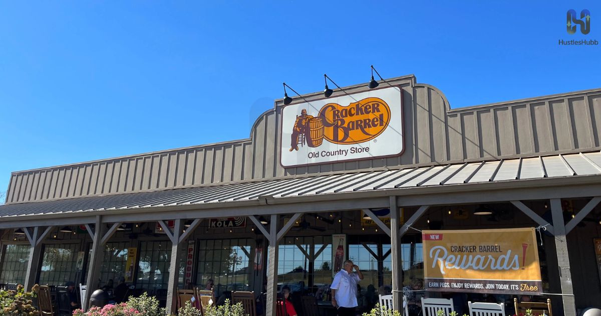
The leadership at Cracker Barrel says the new design is not about erasing the past but about keeping the brand relevant. According to Sarah Moore, Chief Marketing Officer, the restaurant wants to “honor tradition while making sure the next generation sees us as a place for them too.” The Cracker Barrel makeover campaign is tied to its All the More campaign, which focuses on celebrating togetherness, fresh food, and modern comfort.
The Cracker Barrel new text-only logo also reflects the wider trend of simplified, flat designs in branding. Companies like Starbucks, Burger King, and Pizza Hut have all gone through similar rebranding moves. A cleaner font, a refined Cracker Barrel color palette, and a text-only look signal that the restaurant is moving closer to modern values while trying to keep its Southern vibe intact.
First Major Cracker Barrel Logo Change Since 1977
This redesign matters because it is the first change since the 1977 logo update. That makes it a 48-year gap between logos. For almost half a century, Americans have seen the same rustic barrel-and-man image on highways across the country. This consistency built deep loyalty among families, making the Cracker Barrel brand identity unique in the dining industry.
Changing now shows that the company understands the balance between holding onto nostalgia and reaching a new market. The decision ties into the brand’s growth strategy, which involves the Cracker Barrel restaurant redesign and the roll-out of brighter, more open dining spaces. The logo is not just a design shift; it represents a cultural reset for a restaurant that prides itself on country charm.
Customer Reactions: Divided Opinions Across the USA on Cracker Barrel
Across social media, the Cracker Barrel logo change has sparked divided responses. Many nostalgic Cracker Barrel customers believe the rustic man-and-barrel image was a symbol of tradition and family values. To them, removing it feels like losing part of the restaurant’s history.
At the same time, younger audiences are praising the fresh, text-only design. For them, the new look fits better with digital spaces, mobile apps, and modern advertising. News outlets, including reports by Joseph Lamour, highlight how the debate mirrors broader conversations about how brands adapt in a changing America.
Cracker Barrel’s CEO and Leadership on the Transformation
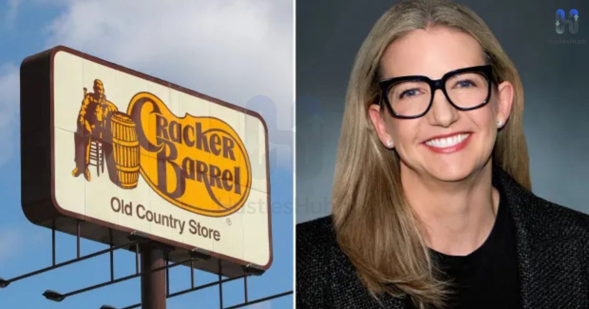
Julie Felss Masino, the current CEO, has emphasized that the restaurant is not moving away from its roots. Instead, the company is using the All the More campaign to show that its mission of country hospitality values is still strong. The redesign is meant to be more inviting to families who may not have grown up with the brand but are seeking authentic food experiences.
Meanwhile, Sarah Moore explained that the move is part of a long-term vision that blends legacy with modern expectations. The leadership believes that while backlash is expected, the redesign opens doors to a new generation of diners who want a mix of tradition and fresh appeal.
Comparing Cracker Barrel’s Move With Other Brands
The Cracker Barrel logo change is not an isolated case. Brands like Burger King simplified their logos in 2021, while Starbucks and Dunkin’ also stripped down their designs for modern relevance. In almost every case, these companies faced criticism at first but later gained acceptance as customers adjusted.
Industry experts note that Cracker Barrel’s new text-only logo fits into this trend of minimalism. Unlike its competitors, though, the challenge lies in balancing modernization with strong ties to Southern vibe and country charm. This makes the restaurant’s case particularly unique and riskier than others.
What This Means for Cracker Barrel’s Identity and Culture
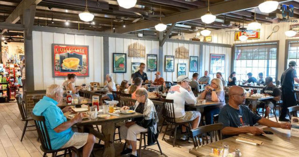
The new logo is just one part of a larger Cracker Barrel restaurant redesign. Stores are being updated with brighter interiors, lighter wood tones, and a modern farmhouse aesthetic. This makeover is aimed at making spaces more welcoming for younger audiences while still keeping rocking chairs, fireplaces, and retail sections alive.
The bigger challenge is cultural. For a restaurant deeply tied to nostalgia, music, and traditional meals, modernization risks creating a divide. Yet if done correctly, it could strengthen the Cracker Barrel brand identity by showing that the company can evolve while protecting the values that define country hospitality.
The Cracker Barrel Fall Menu Launch Alongside the Logo
The timing of the new logo matches the debut of the Cracker Barrel fall menu 2025, an important move in the rebranding effort. The seasonal menu includes classics and new creations such as Uncle Herschel’s Favorite, Hashbrown Casserole Shepherd’s Pie, Butter Pecan French Toast Bake, and the hearty Slow-Braised Pot Roast. Desserts like the Butter Pecan Sticky Buns and Cinnamon Roll Skillet dessert are expected to be top sellers.
To complement the food, beverages like the Brown Sugar Latte and refreshing Wild Berry Tea are also part of the Cracker Barrel nationwide promotion. This pairing of new branding with seasonal favorites shows how the company is using food to create excitement around its new identity.
| Fall Menu Highlights 2025 | Category |
| Uncle Herschel’s Favorite | Classic Breakfast |
| Hashbrown Casserole Shepherd’s Pie | Comfort Meal |
| Butter Pecan French Toast Bake | Breakfast/Dessert |
| Slow-Braised Pot Roast | Dinner Special |
| Butter Pecan Sticky Buns | Dessert |
| Cinnamon Roll Skillet dessert | Dessert |
| Brown Sugar Latte | Beverage |
| Wild Berry Tea | Beverage |
Risks and Rewards of a Bold Cracker Barrel Branding Change
Every rebranding comes with risk. For Cracker Barrel, the main risk is alienating nostalgic Cracker Barrel customers who may feel abandoned. Losing the rustic logo could also weaken emotional ties built over decades. In a competitive dining market, that loyalty is not easy to replace.
On the other hand, the rewards are significant. A modern logo and restaurant redesign attract younger diners, expand media coverage, and give the brand a chance to stay relevant. The launch of items like Farm fresh scrambled eggs and biscuits, paired with promotions such as a Complimentary Classic Side, shows how the company is using food deals to bridge the gap between tradition and change.
What’s Next for Cracker Barrel’s Future?
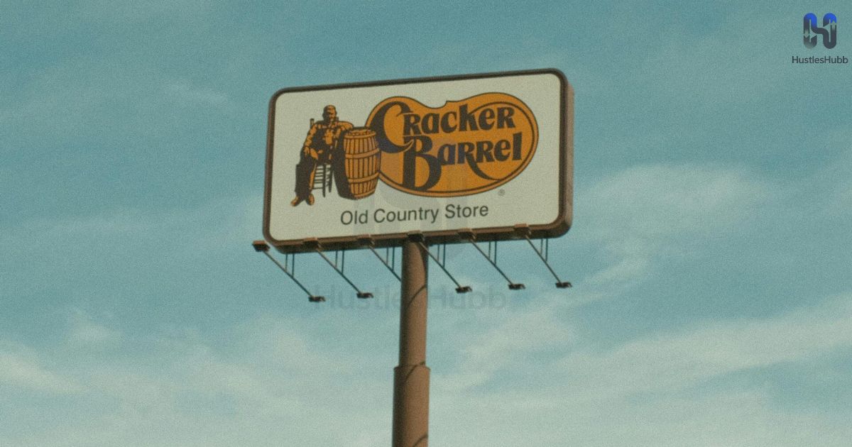
The future of Cracker Barrel will depend on how well it balances its heritage with innovation. The company is expected to continue its makeover campaign, invest in brighter stores, and create more digital-first advertising. Collaborations, like the Jordan Davis Cracker Barrel commercial, are signs that the brand is leaning into music and culture to stay relevant.
Ultimately, the question is whether Cracker Barrel’s new text-only logo will strengthen its brand identity or fade into controversy. With leadership from Julie Felss Masino and the support of campaigns like All the More, the company is betting that evolution is the only way to keep its legacy alive.
Conclusion
The Cracker Barrel logo change after 48 years is not just a design update—it is a cultural statement. It represents the tension between honoring tradition and adapting to the future. Whether customers embrace the modern farmhouse look or hold onto the old rustic charm, this moment will be remembered as a turning point in American dining history. The logo may be new, but the spirit of country hospitality that defines Cracker Barrel remains unchanged.
FAQs
Why is the Cracker Barrel changing?
Cracker Barrel is updating its logo and branding to reflect a more modern farmhouse aesthetic while keeping its country charm.
What’s going on with Cracker Barrel?
The company is rolling out a brand makeover campaign, including a new text-only logo and fresh menu items.
Why are seniors not going to Cracker Barrel anymore?
Some seniors feel the Cracker Barrel brand identity is shifting away from tradition, but many still enjoy the classic meals.
Why is Cracker Barrel shutting down?
Cracker Barrel isn’t shutting down nationwide; it’s only closing underperforming stores while focusing on a nationwide promotion strategy.
What is Cracker Barrel changing its name to?
Cracker Barrel isn’t changing its name; only the Cracker Barrel logo change was announced, not a name change.

Welcome to Hustles Hubb! I’m Shafqat Amjad, an AI-Powered SEO and Content writer with 4 years of experience.
I help websites rank higher, grow traffic, and look amazing. My goal is to make SEO and web design simple and effective for everyone.
Let’s achieve more together!

1 thought on “Cracker Barrel’s New Logo: Why the Change Matters After 48 Years”